CONTEXT
Webex is Cisco’s AI-powered collaboration platform for meetings, messaging, calling, events, and teamwork trusted by 95% of fortune 500 companies. Used by organizations at significant scale, the platform brings a broad range of workplace capabilities into one product.
This project focused on the first-use experience: how new users, including those transitioning from other collaboration platforms, are introduced to Webex and begin using it.
ROLE OVERVIEW
Within a four-person team, I contributed to user interviews and usability testing, then took primary ownership of research synthesis, design direction, interface design, and prototyping. I built the complete visual system and experience in Figma, then used Figma MCP, Claude Code, and other AI tools to bring it into code as a functional prototype. I also led internal critiques and Cisco reviews, using feedback to guide the design through each stage.
RESULTS
▴ 90%
AI feature discovery
From 33%
▴ 4.2/5
User confidence
From 3.2/5
▴ 4.3/5
Overall ease
From 2.8/5
SOLUTION
An onboarding session built for confident discovery
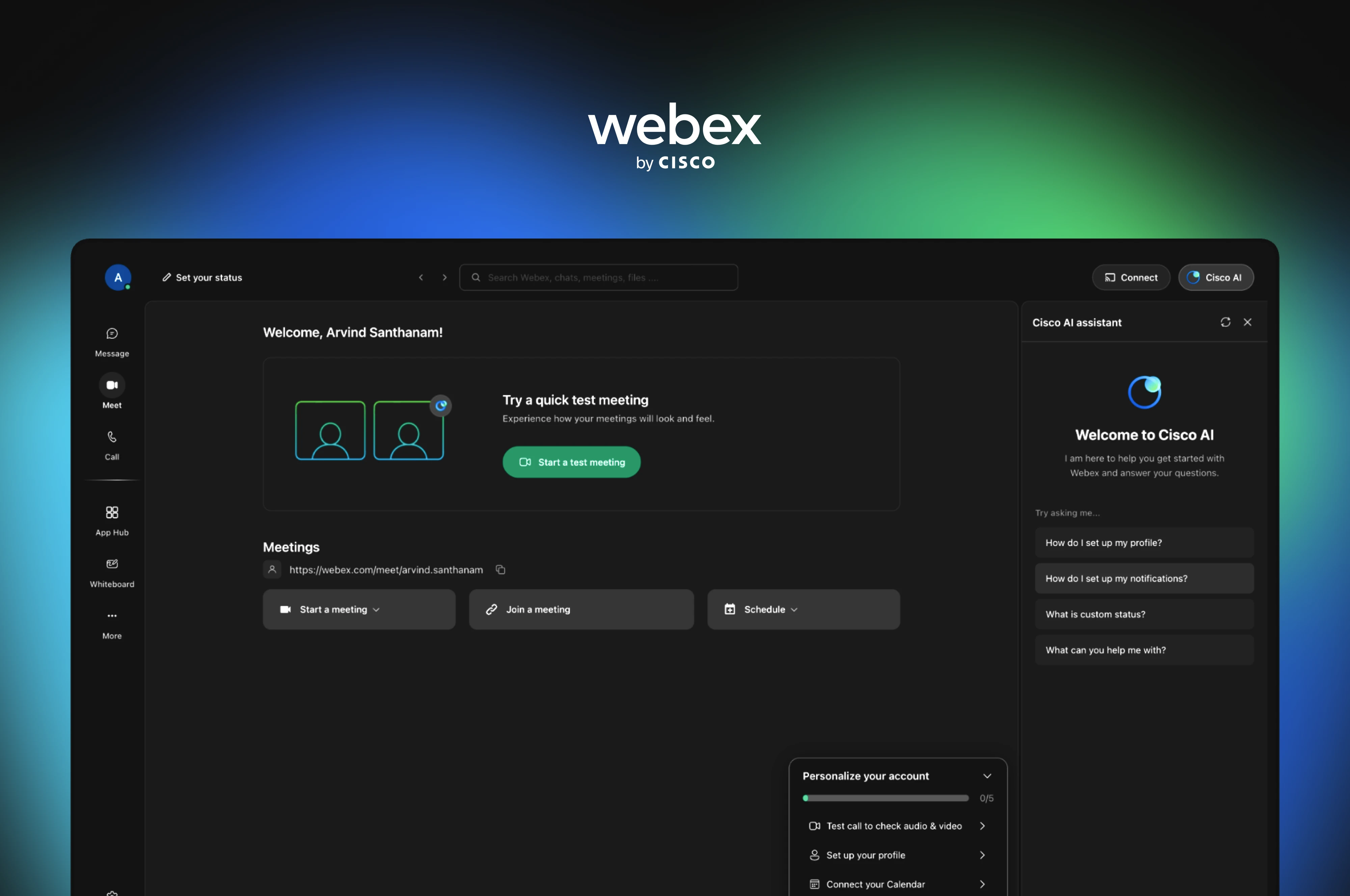
The solution reduced unnecessary friction, used familiar patterns to guide users forward, and surfaced Webex’s key capabilities at the moments they were most relevant. I designed the full experience in Figma, then took it into code using AI tools to build a working prototype ↗
PROBLEM
What was stopping new users from reaching Webex’s value?
Webex wanted to make onboarding more approachable for first-time users and people transitioning from other collaboration platforms. The opportunity was clear, but the underlying barriers were not.
Our challenge was to understand what prevented these users from getting started confidently, discovering the breadth of Webex, and beginning to collaborate without confusion or disruption.
RESEARCH
Understanding expectations before redesigning the experience
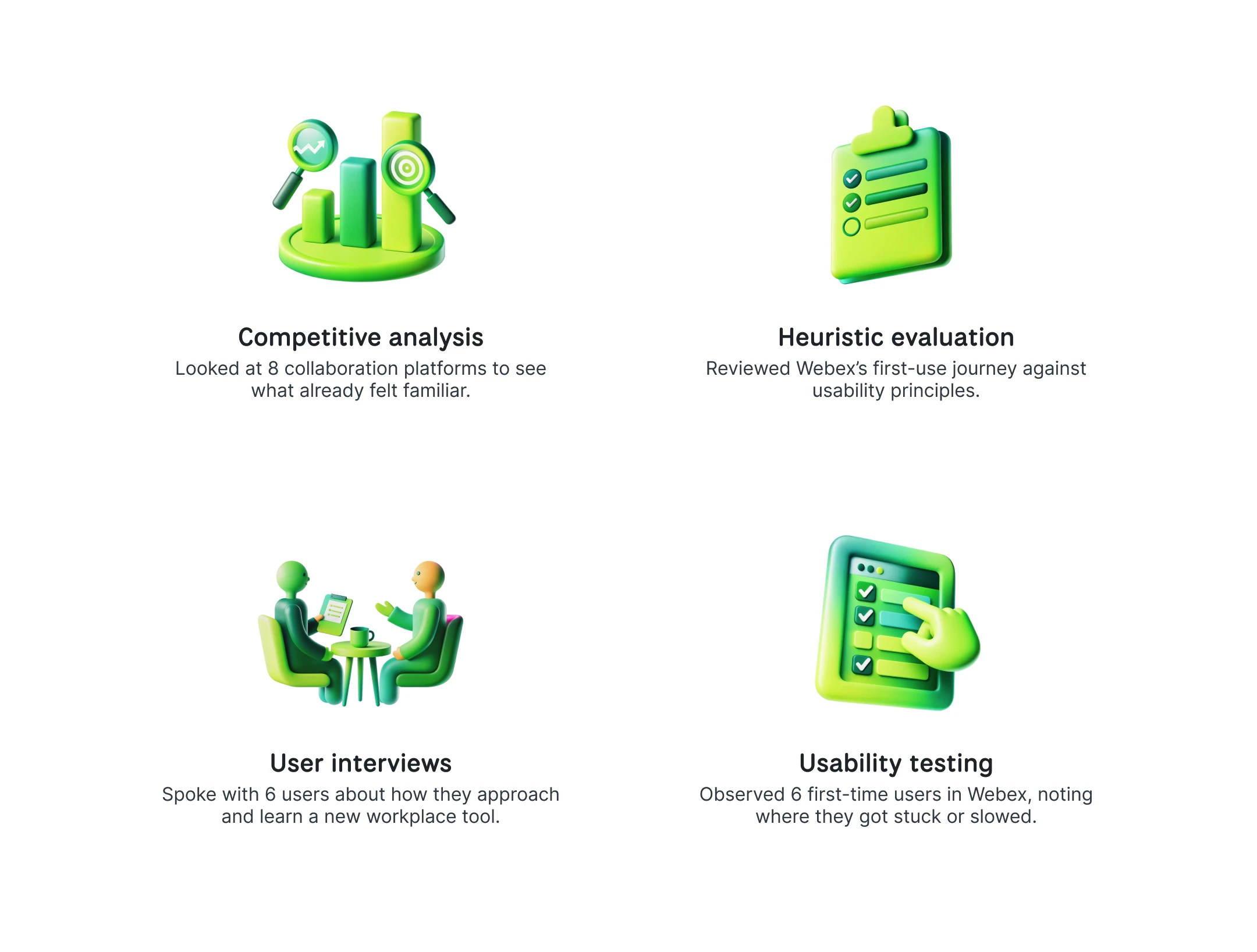
I wanted to understand what users already expected from collaboration tools and where Webex’s first-use experience broke those expectations. We explored this through four methods:
INITIAL FINDINGS
Users arrived with familiar expectations, but struggled to find Webex’s value
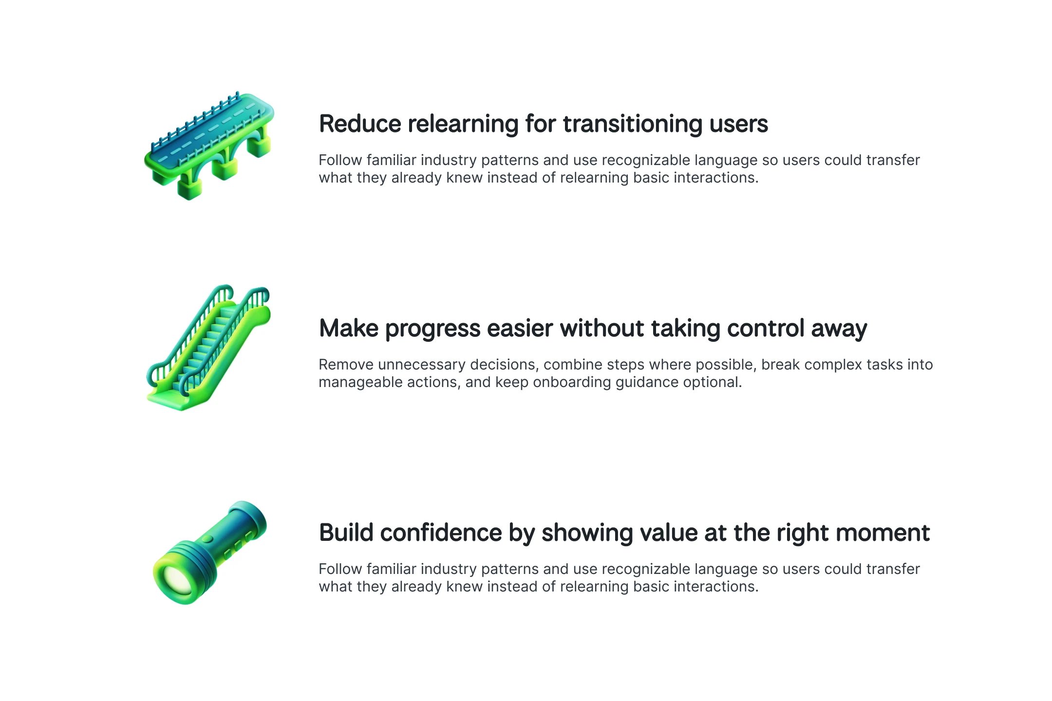
First-time and transitioning users came to Webex with expectations shaped by other collaboration tools. When terminology, controls, or interactions felt unfamiliar, they had to pause and figure out what to do instead of moving forward confidently. This was especially challenging when users were trying to complete a specific task or understand where to begin.
Users preferred learning by exploring, with clear feedback and guidance at the right moment. Familiar patterns increased confidence, while dense information, inconsistent interactions, and unclear next steps made Webex harder to approach. Onboarding needed to connect users’ existing expectations with Webex’s broader value.
DESIGN PROCESS
From Figma foundations to an AI-assisted prototype
Because Webex’s internal design system was confidential and unavailable to our team, I recreated the necessary visual foundations in Figma, defining variables, reusable components, and interaction patterns before moving into code. I then used Figma MCP, Claude Code, and other AI tools to vibe-code a functional prototype that stakeholders could experience instead of reviewing only static screens. This was a concept proposal, not a production build or developer handoff, which gave me room to rethink the onboarding experience while respecting Webex’s existing architecture. Throughout the process, I questioned the purpose of every element and piece of copy, simplifying or removing anything that did not help users move forward.
DESIGN DECISIONS
The redesign involved many interconnected decisions across entry, setup, navigation, feature discovery, and meetings. The five comparisons below focus on the decisions that best show how I translated the research into a clearer and more confident first-use experience.
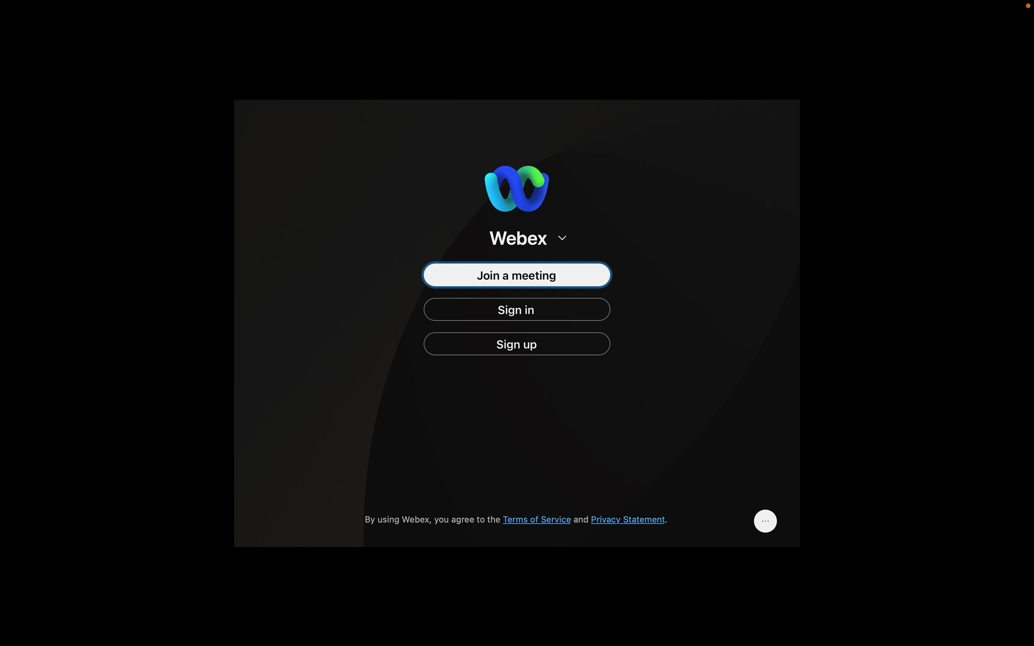
Simplifying sign-in and account creation
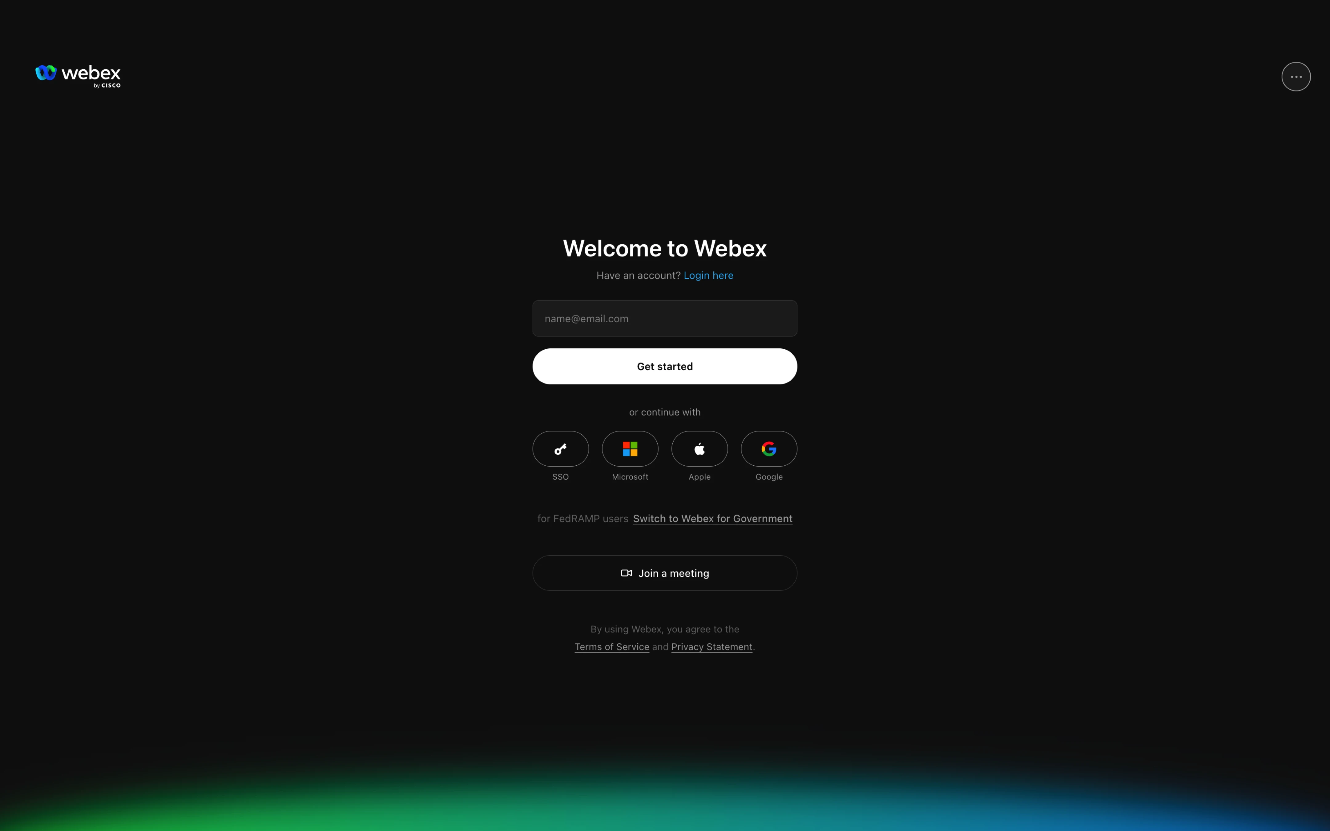
The original screen gave Join a meeting the highest priority. Anyone trying to access an account had to choose between Sign in and Sign up before reaching familiar options such as Google, Microsoft, Apple, or SSO. Our competitive analysis showed that users were accustomed to seeing these options upfront, so I brought them onto the first screen. I also replaced the separate email paths with one email field. If the email belonged to an existing account, the next screen asked the user to sign in. If it did not, the user continued with account creation. Join a meeting and Webex for Government remained available, but no longer dominated the experience.
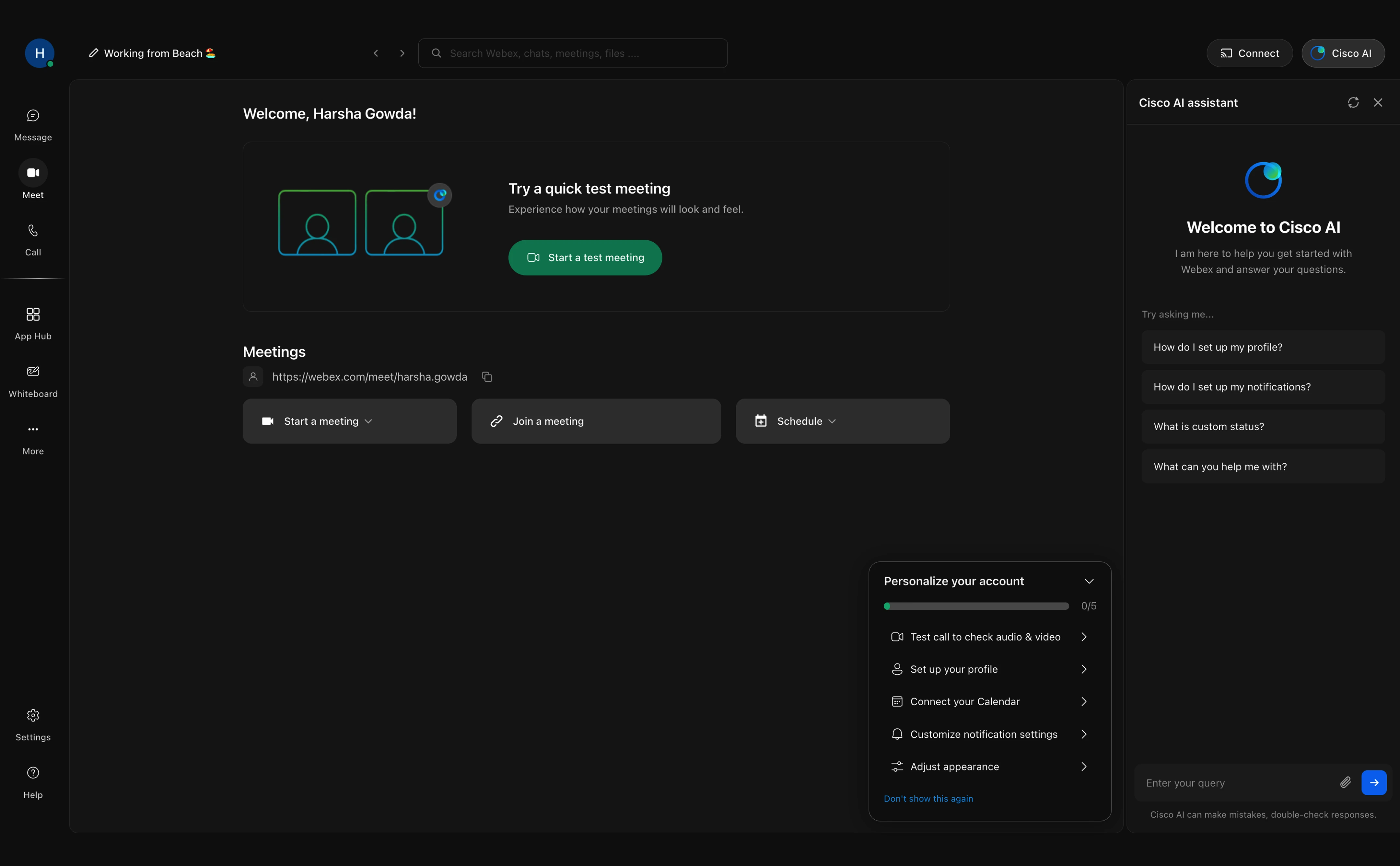
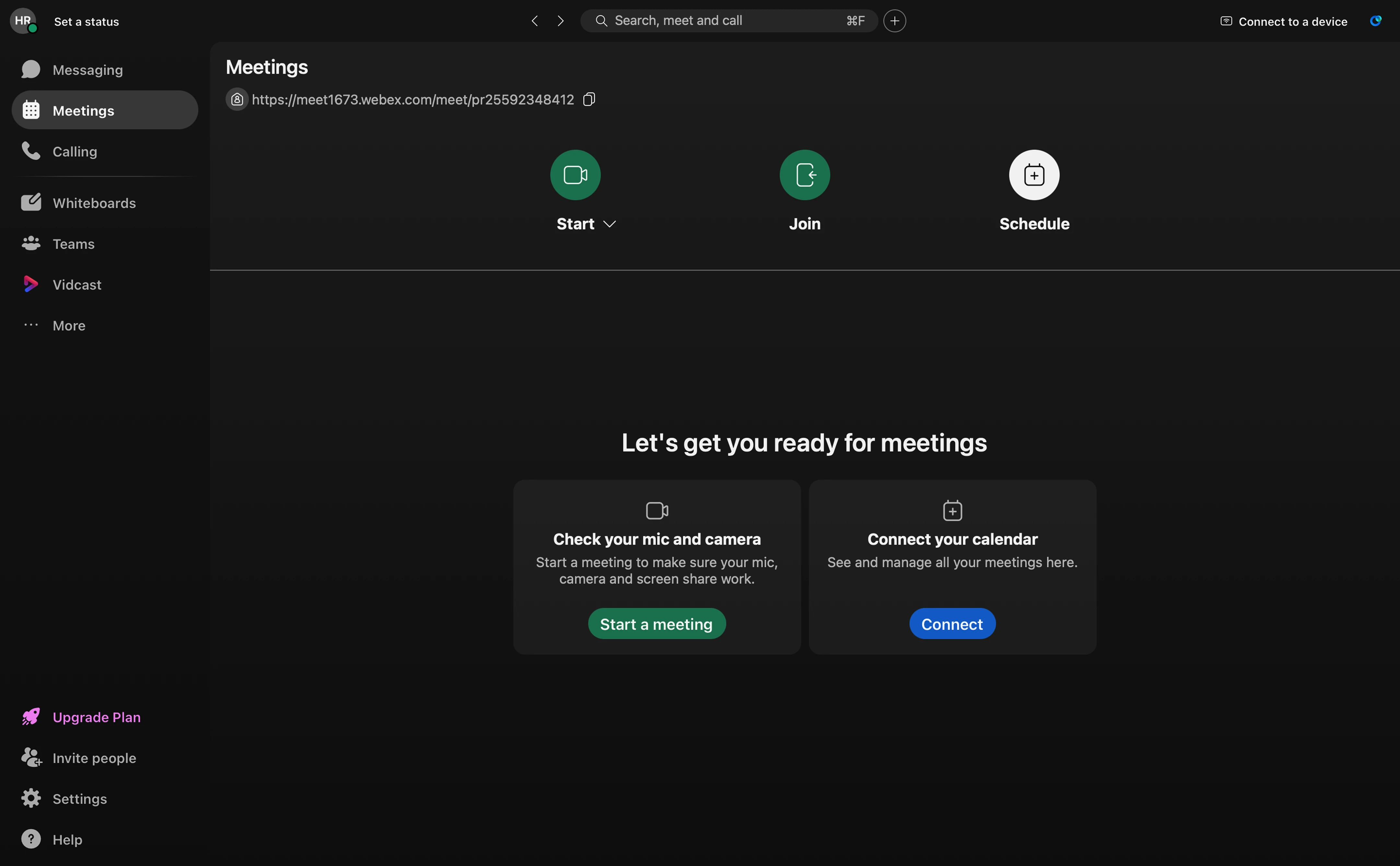
Creating a clear starting point on the dashboard
After signing in, users saw five actions competing for attention, with no clear place to begin. The sidebar took up valuable space, yet collapsing it removed the labels, while Cisco AI remained behind an icon that users overlooked during testing which made it undiscoverable. I made a test meeting the starting point, kept the navigation compact but labeled, and opened the AI assistant so its value was immediately visible. An optional checklist then allowed users to finish setting up Webex at their own pace instead of being forced through every step.
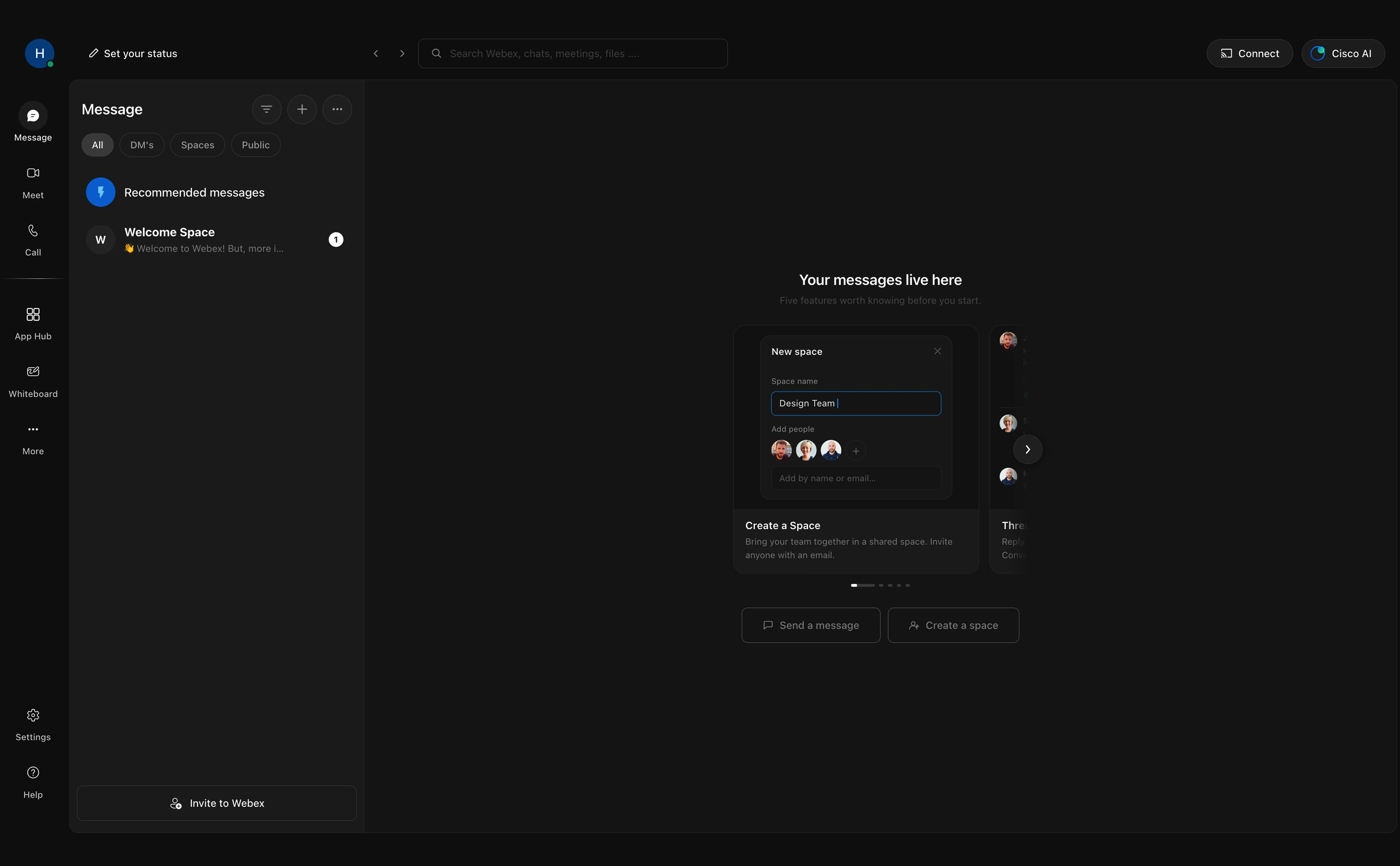
Using the empty state to introduce messaging
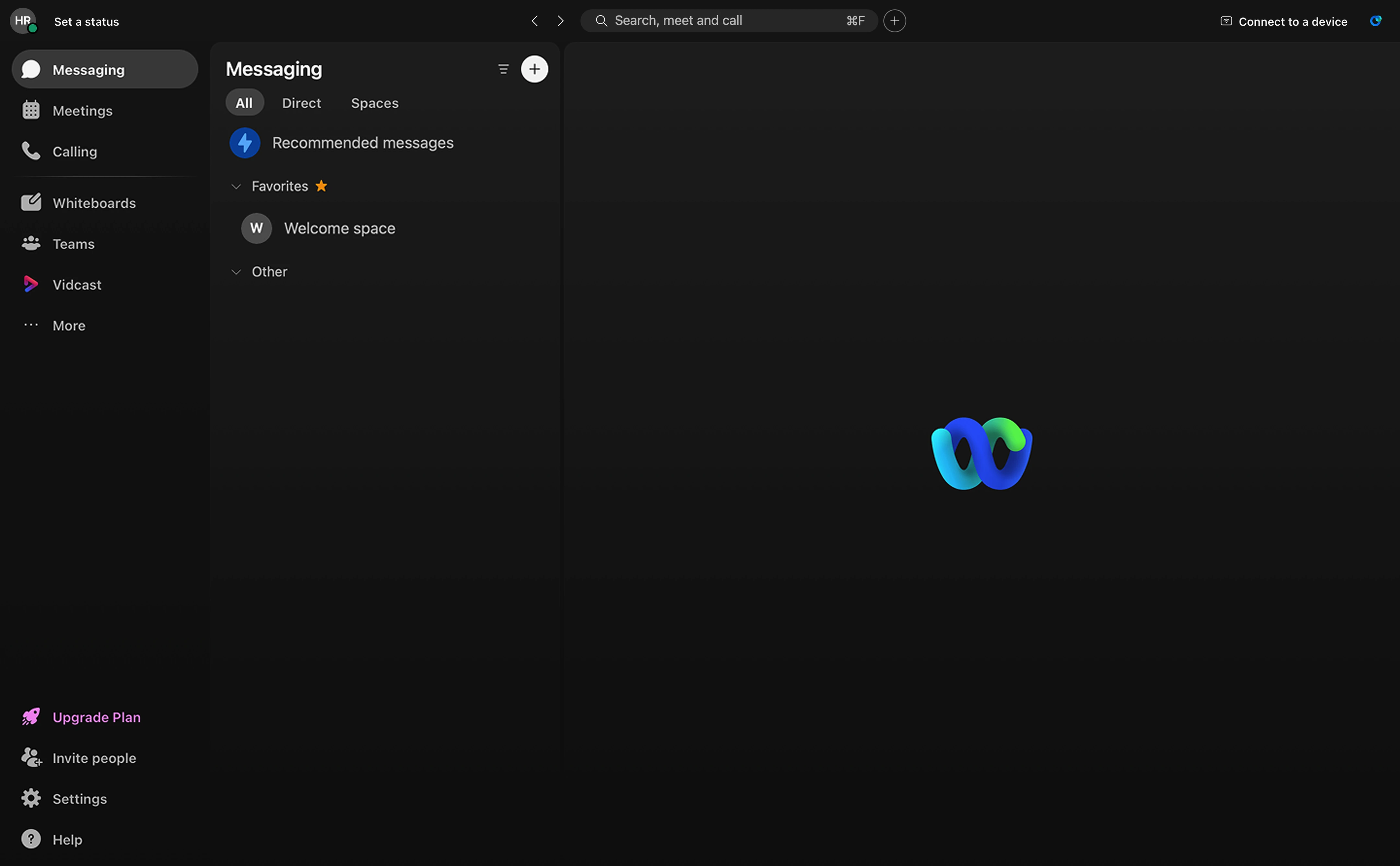
The original messaging screen left most of the workspace empty, offering little explanation of what Webex messaging could do or how a new user should begin. Key actions sat behind a plus icon, while Direct did not match the DM terminology users recognized from other messaging products. I turned the empty state into a five-card introduction to Webex’s messaging capabilities, renamed Direct to DMs, and placed Send a message and Create a space directly on the page. Instead of teaching messaging through a separate tour, the screen now explains its value and offers the next action at the moment users need it.
Guiding users toward relevant apps
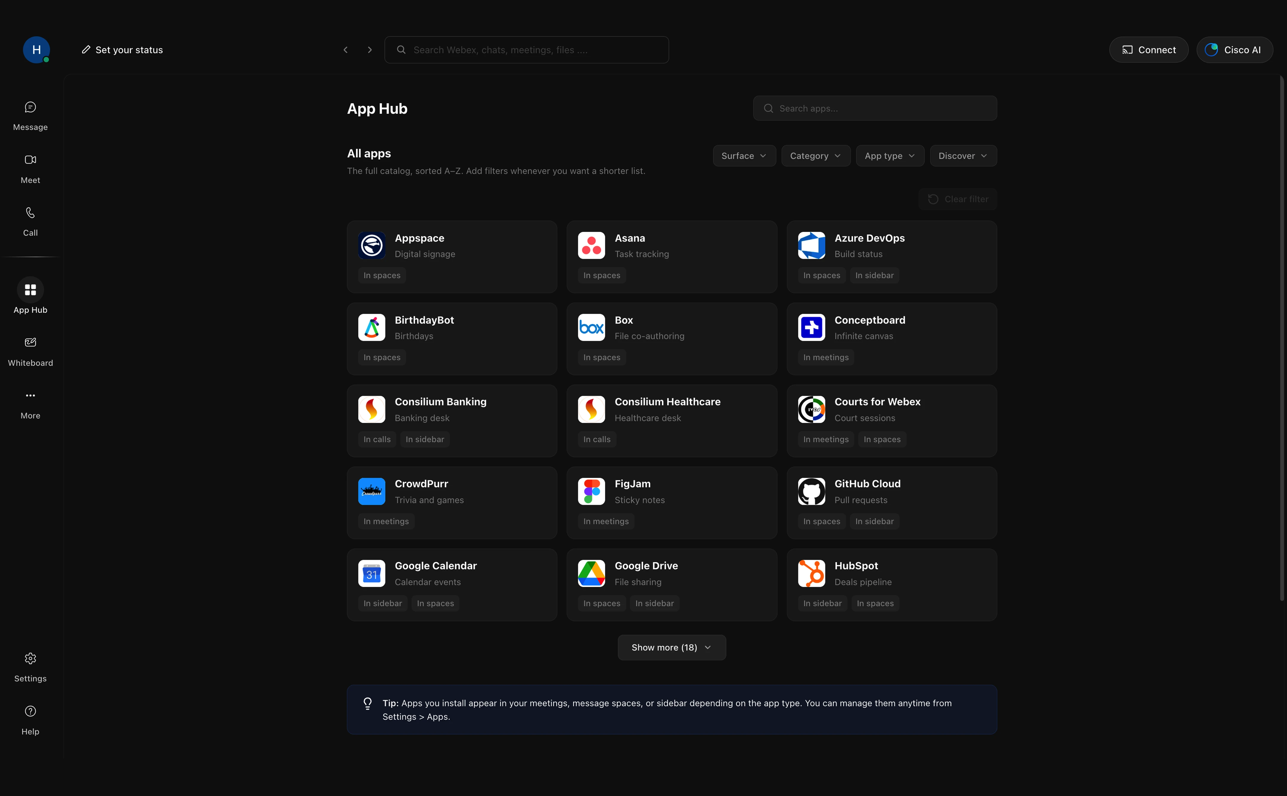
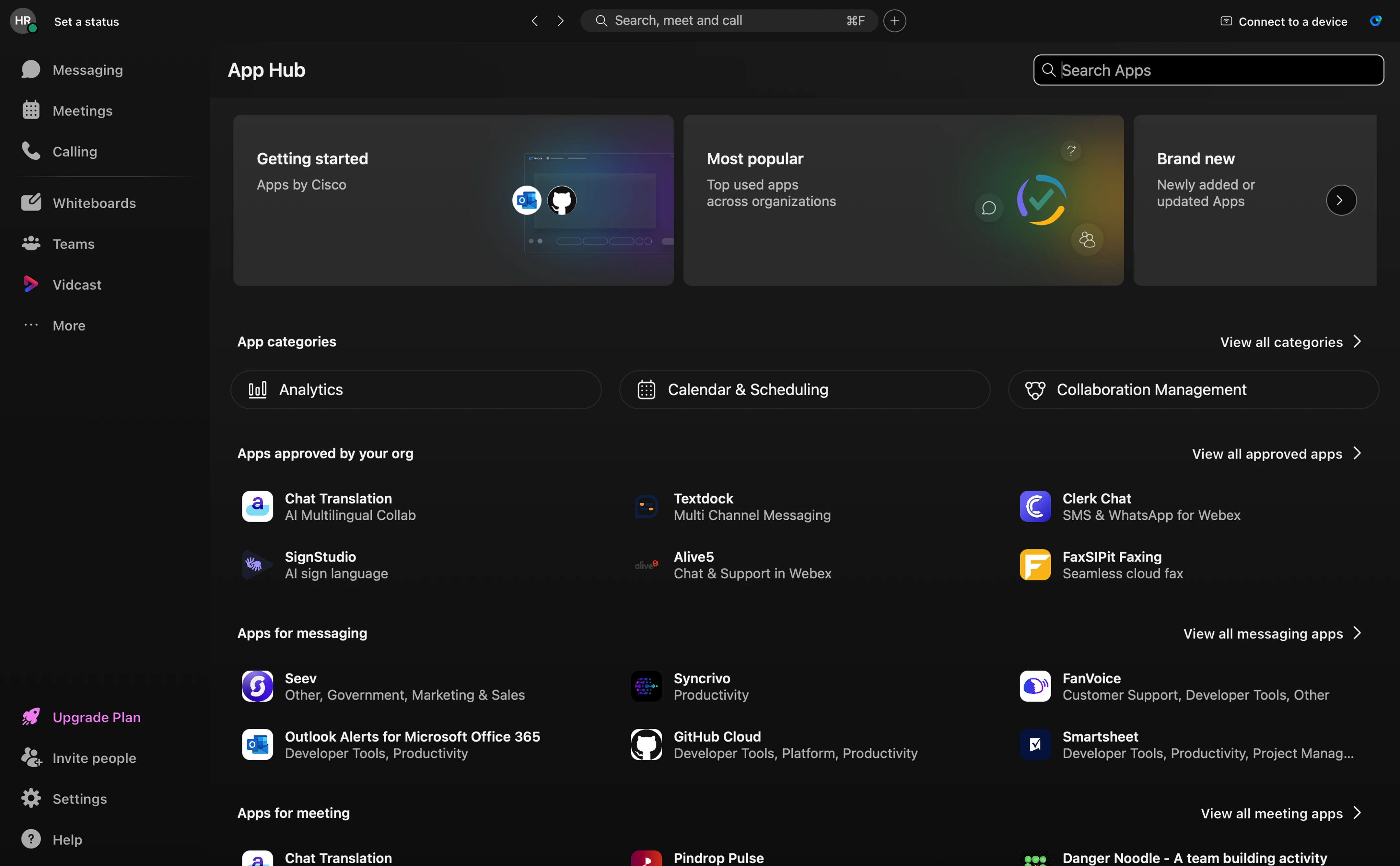
App Hub was hidden under “More” and opened with a large catalog that gave users little guidance on where to begin. Users could see the available apps, but not always what they did, where they appeared in Webex, or which ones suited their needs. I gave App Hub a visible place in the navigation and introduced two questions about where users worked most and what they wanted help with. Their answers shaped the recommendations, while clearer descriptions and filters helped them find relevant apps without opening each one individually.
Clarifying controls during a live meeting
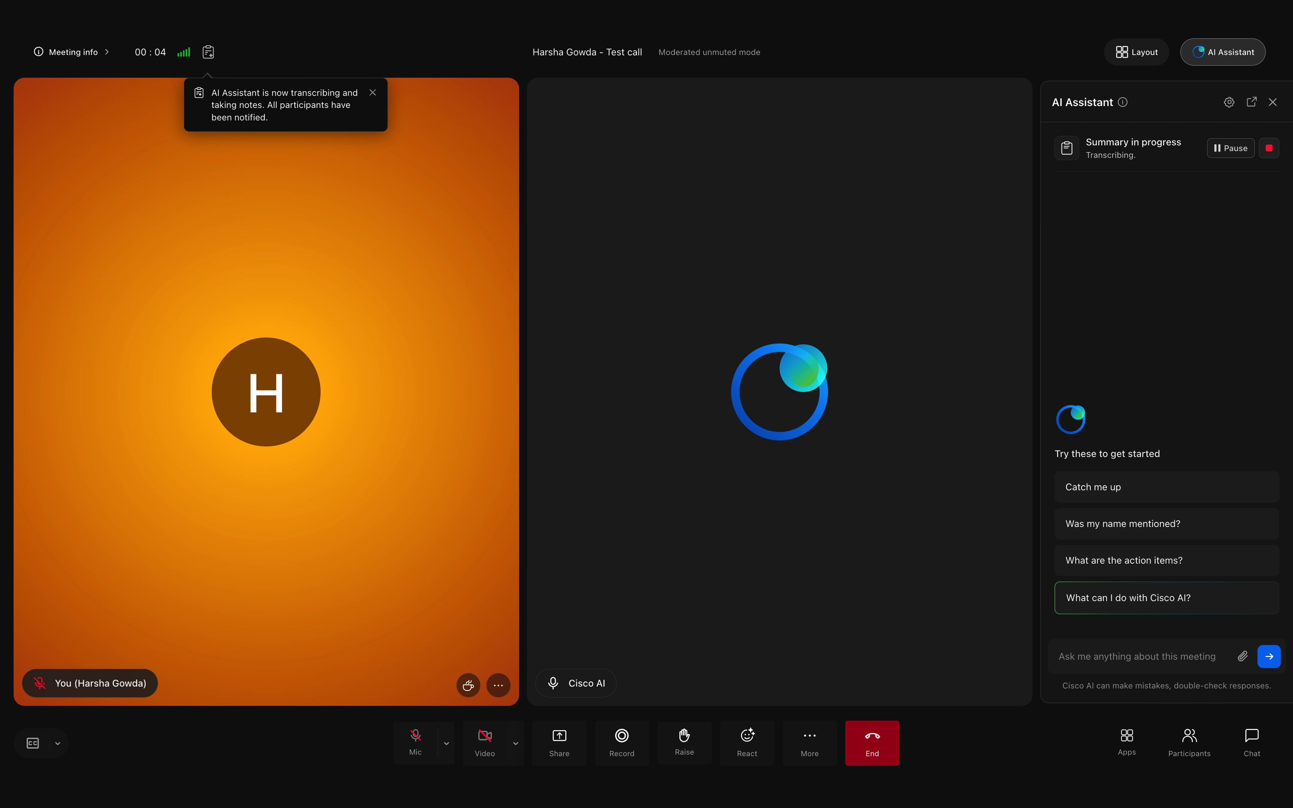
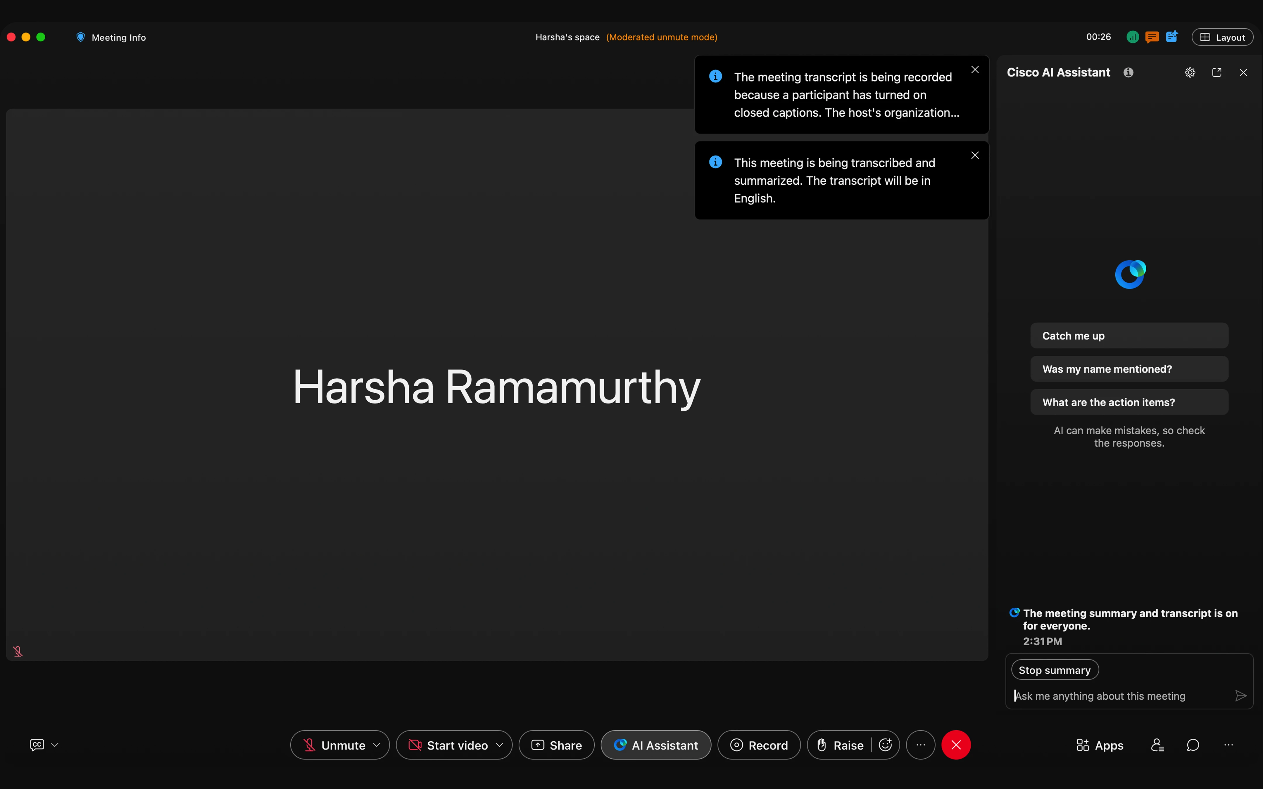
During a meeting, status information was scattered across the header, colors appeared without a clear meaning, and text-heavy controls competed for attention. The AI assistant also moved away from its familiar top-right position, while Stop summary was placed inside the message field and became difficult to find. I brought the meeting information together, returned AI to the top-right, and gave the summary visible pause and stop controls for moments when the conversation became sensitive. I also simplified the control bar and surfaced Step away, making important actions easier to find without adding more noise.
Combining meetings and recaps into one view
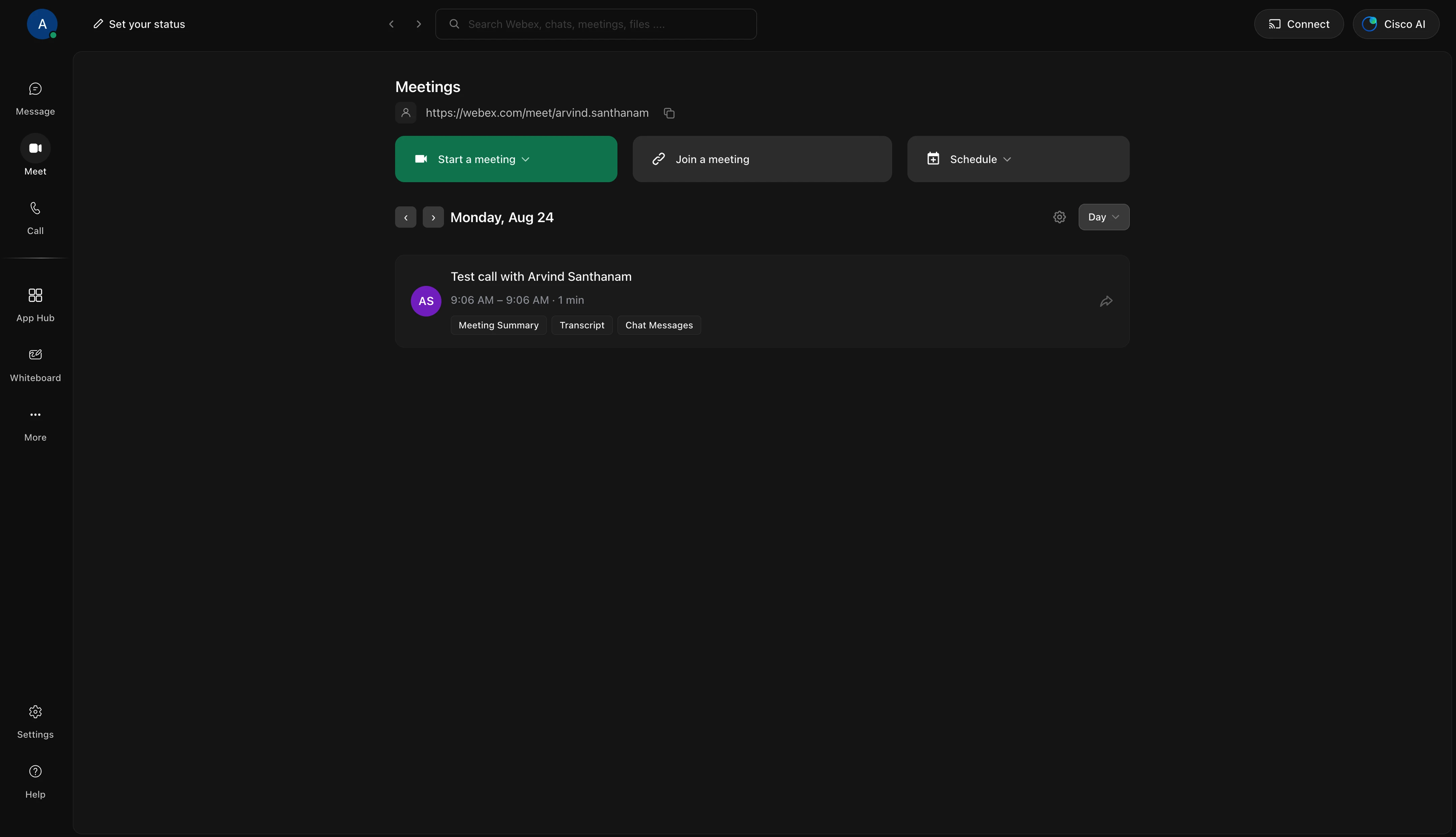
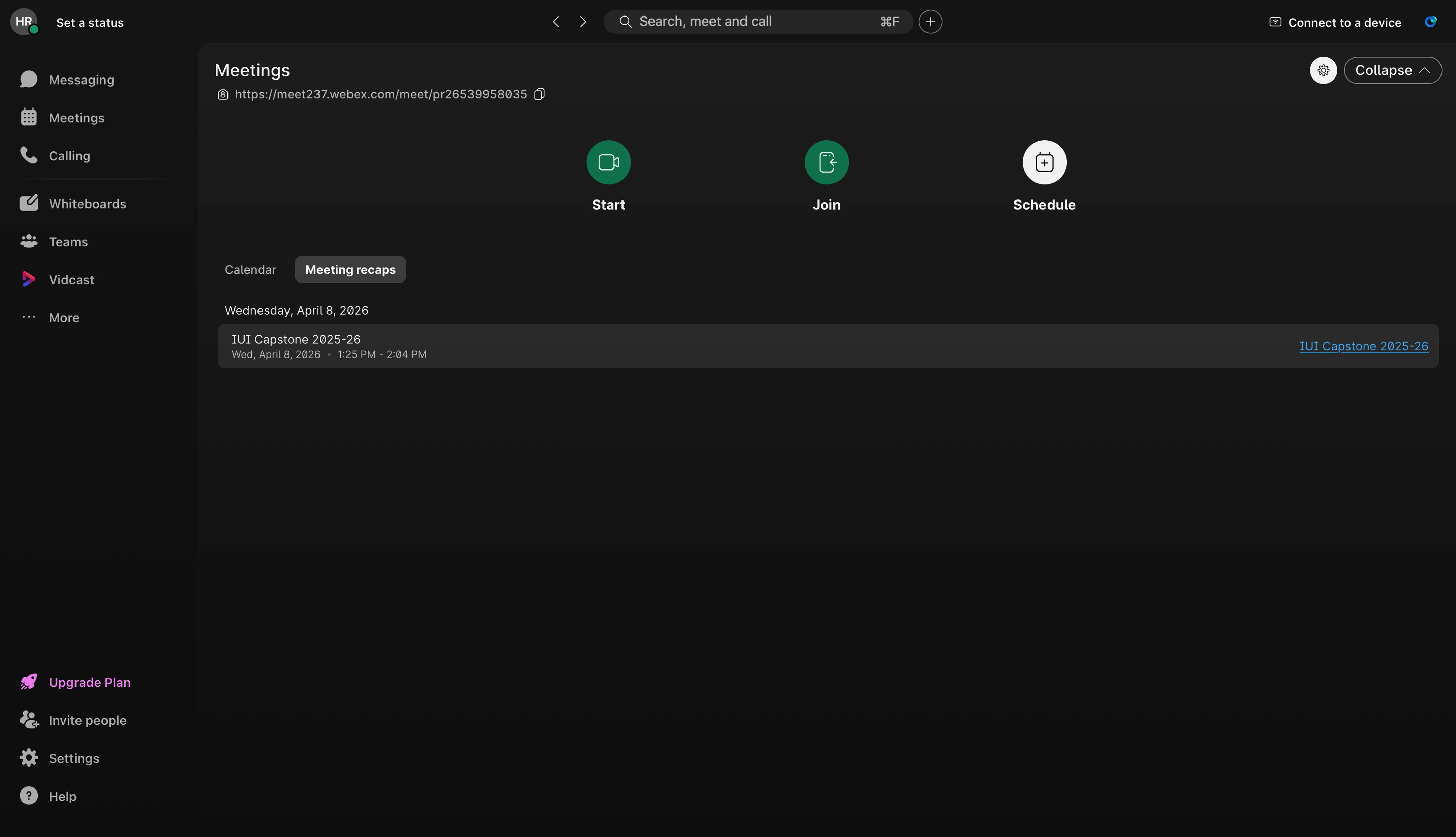
After a meeting ended, users returned to a page where the calendar and Meeting recaps were separated into two tabs. Because the calendar opened by default, users often overlooked the recap tab and did not discover the summary, transcript, or chat messages stored there. I combined upcoming and completed meetings into one chronological view. Each completed meeting now showed direct links to its summary, transcript, and messages, removing the extra step of searching for them elsewhere.
OUTCOMES
We refined the concept through six internal evaluation sessions using critiques and cognitive walkthroughs, then reviewed the direction with the Cisco team across three sessions. The final prototype was tested with 10 participants through contextual think-aloud usability testing. Participants completed all assigned tasks, while AI feature discovery increased from 33% to 90%, user confidence improved from 3.2 to 4.2 out of 5, and overall ease increased from 2.8 to 4.3 out of 5.
Across three review sessions, the Cisco team responded positively to the direction and the problems it addressed. Since the project concluded, newer Webex onboarding experiences have begun to reflect several patterns similar to those explored in our prototype. While we cannot attribute those changes directly to our work, the overlap suggests that our thinking was aligned with the product’s evolving direction.
RETROSPECTIVE
This project was an exploratory proposal, not a production build or developer handoff. Working without access to Webex’s internal design system and full technical or business constraints gave us room to explore the ideal first-use experience, but the solution would still require feasibility, accessibility, and design-system reviews before implementation. With access to product analytics and business goals, the next step would be to prioritize the strongest interventions, test them at production scale, and measure their effect on adoption, retention, and feature use.